Free Automotive Design Course
Automotive Design & Marketing Management
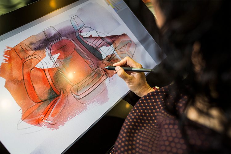
We are currently seeing the styling phase of the car, which consists of the sketching, the 3d design and then the clay model. We saw in the previous post a way to create side views in the sketch, although this free automotive course focuses on providing an overview of the car design process. In this post we are going to focus on the strategy of the design of the car's surfaces, that is, we are going to see why a designer chooses certain lines or others. This is useful in any of the areas of car styling. So we found it necessary to make this introduction and explanation of some issues before starting with the Cad design phase.
SURFACE DESIGN STRATEGY
Surface design strategy
We are going to see the design strategy from the aesthetic point of view, trying to understand why the designers choose some lines or others. There is a creative component, and therefore totally subjective. So the same design may like some and be hated by others. But in the automotive industry there are guidelines, supported by studies, that help us to know which lines to use to guide our vehicle to a specific audience.
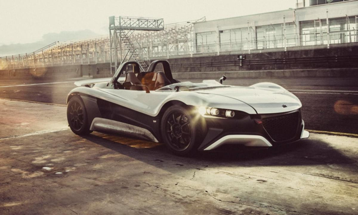
According to Guillermo Echevarría Miller, CEO of Vühl, for this delivery of drivingyourdream, the elements that he considers key for a sketch to stand out are three:
From Drivingyourdream we appreciate the time dedicated to giving us your valuable opinion, which in fact is very accurate and consistent.
INFLUENCE OF VISUAL DESIGN
Influence of visual design on consumer perception
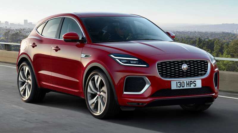
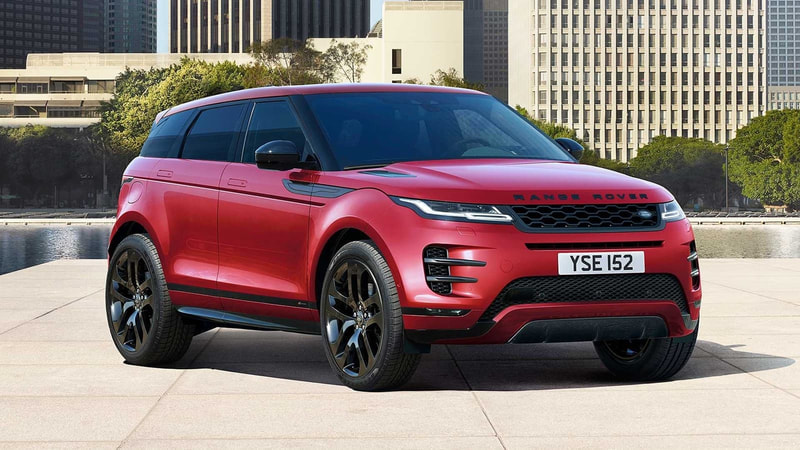
Currently, more cars share a platform, although this does not imply that mechanically the vehicles are the same; there is more differentiation due only to the aesthetics of the vehicle, in addition to its multimedia services. The use of these platforms allows great cost savings due to the economy of scale, which allows the brand to put profitable products on the market. However, there is a risk that the buyer will not distinguish between the different brands and will not find a differential value. If this happens, the different brands that share a platform would compete for the same market sector, instead of targeting completely different markets.
Jaguar E-Pace and Range Rover Evoque share platform
For this, the designer must understand the influence of visual design on consumer perception, in the same way that he needs to differentiate between different models. That is, the designer must know how the different aesthetic attributes of the car position the brand in the market, do they position it in the luxury or premium sector? Are you targeting a youth or adult audience? If a designer had an overly defined design style and had to work on three models for three different brands with the same platform, it would have the disadvantage that he would make three identical models and they would not be differentiated by brand.
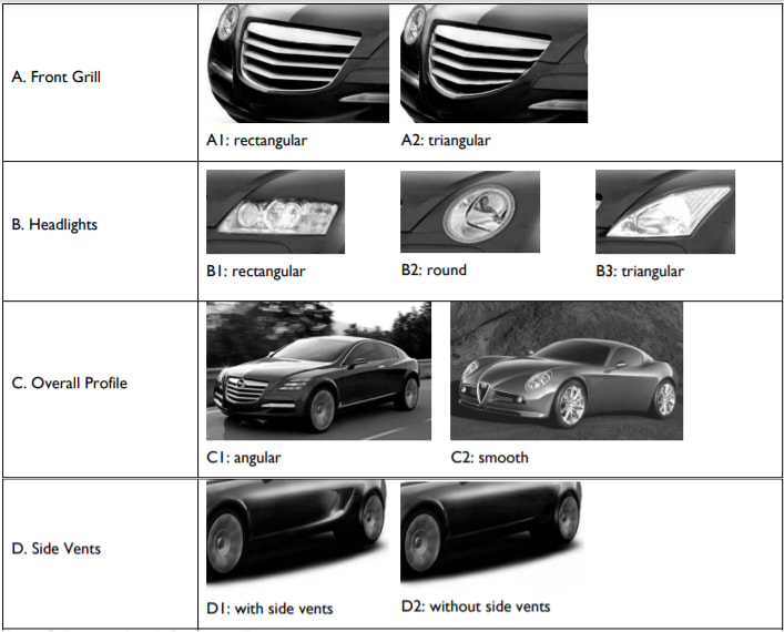
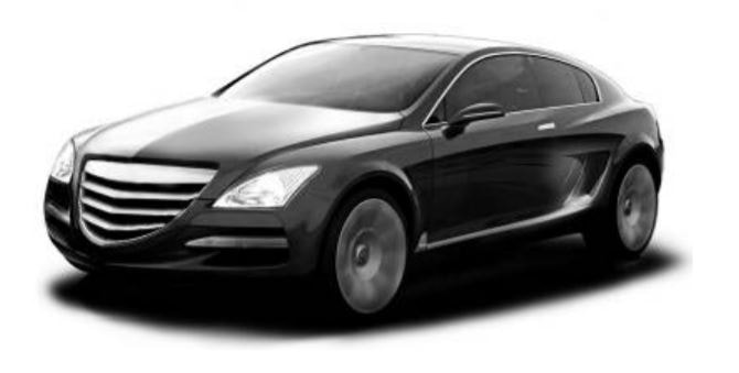
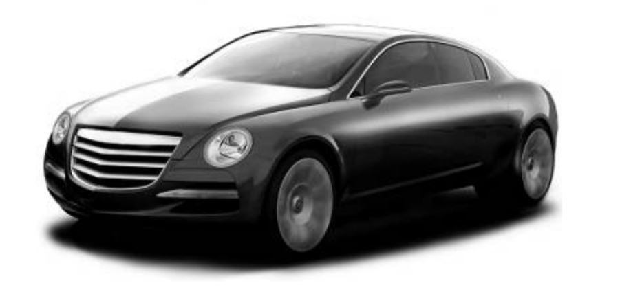
However, there is an additional problem, it is not the same designer who usually works on the different vehicles that share a platform, but rather that each vehicle is designed in its corresponding design studio. Therefore, each of these designs must target a specific market that is totally different from the other. This is one more reason for the use of automobile design language and the market studies that are carried out before designing a vehicle. Each brand will have its target market and its own design characteristics. The designer can work on reinforcing the brand image of the vehicle through the use of visual elements and the application of totally differentiated design features. For example, the shape of the headlights and the front grille of the vehicle are elements of the bodywork that greatly impact people's perception of the technical characteristics that they think the vehicle has, whether they are true or not. For designs that are too similar, there are some body design tips that position the vehicle relatively easily. To see it, we are going to take as a reference the study carried out by Lin-Lin Chen, Hsien-Chang Kang and Wei-Ken Hung at the Ming-Chi University of Technology. Normally at drivingyourdream we rely on material that cannot be published, but in this case, the material is public content so we leave you the source in case it is of your interest. This type of study can always help us to argue our designs, especially if we are just starting out.
As part of the previous study, it can be concluded that the absence of triangular or vertex elements provides a greater sense of reliability and tranquility; on the basic shape of a vehicle.
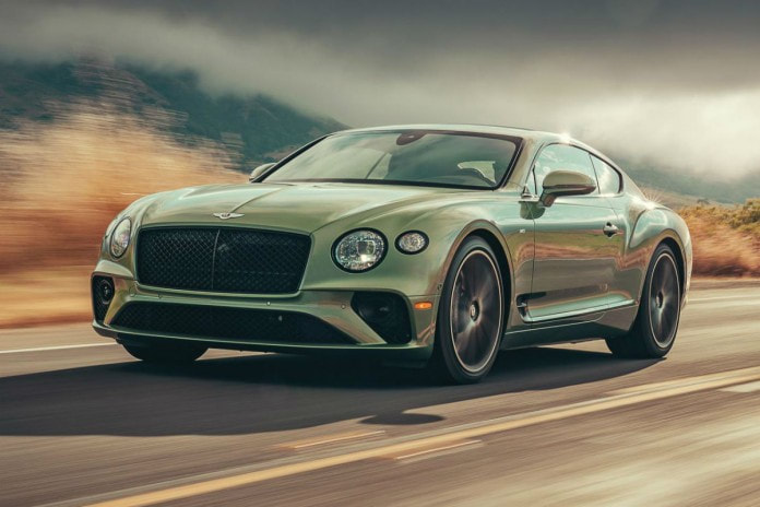
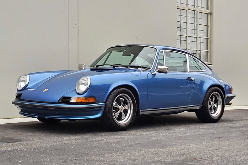
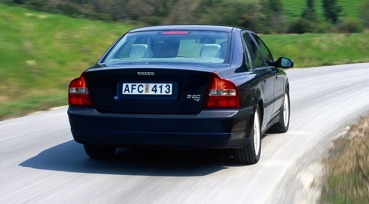
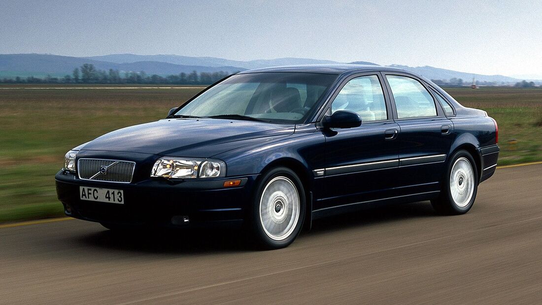
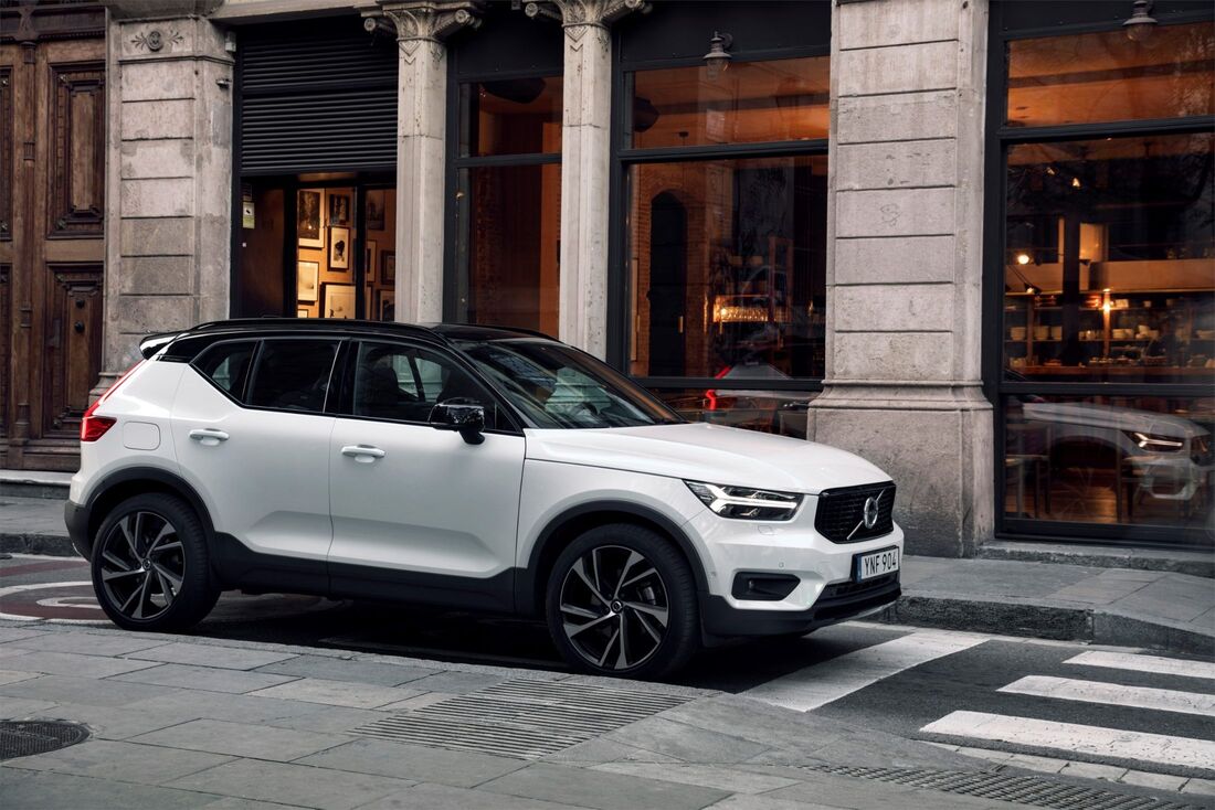
These elements seen above were studied in isolation, so they should not be used universally since in the surface design of a vehicle there are many elements that come into play and that can reconfigure these perceptions; as we indicated in the case of the Porsche 911 or the Bentley Continental GT. In these cars, the muscular appearance and the brand image help the customer to have totally different perceptions. Let's look at one more example of the surface design strategy to impact customer perception: Volvo is known for safety, so the designers had to translate that image into Volvo's surface design and made the brand's signature rear. This enhances the appearance of security and makes the doors appear much thicker. In this case, in a way there is an approximation between the attribution (wider doors) and the reality (the side shoulder of the volvo). This makes it a very powerful concept from a cognitive point of view, since there is a coherence between the message you want to convey and how it is projected in reality. That is, what is meant, in part, is true. An example of the opposite would be false exhausts, it would be totally contrary to what you want to convey with the reality of the vehicle. Since Volvo is positioned in the market for safety, it makes sense to design with the intention of conveying the greatest sense of safety possible. So the designers did not settle for Volvo's marked shoulder. They added smooth sides like a wall and a V-shaped hood. The grill is also an essential part to convey security, it always maintains square shapes and tries to convey an airtight and closed image. Note that Volvo revamped its design language in the 1990s, then revamped it again in 2018 after its acquisition by Geely. So there are differences between the design language of the 1998 Volvo S80 and the current Volvos. Still, many elements have prevailed like the signature shoulder, but have been modernized to give them more dynamism, among other attributes. To do this, it incorporates key elements such as the “T” shaped Drl lights and the floating grille to achieve the same effect that was sought in the previous language, but adapted to current times.
The design of the vehicle surface has to comply with the design language and also be aligned with the values of the brand. For example, BMW employs strong and dynamic lines that communicate its vehicle values of performance and power.
MAIN LINES IN CAR DESIGN
Main lines in car design
In this section we are going to acquire some basic automotive design slang.
When designing the exterior of a car, it must be considered that the vast majority of surfaces are made up of curves, not straight lines. Even when a car appears to have some straight lines in its design, they will usually be curved with a very large radius. This does not happen only for aesthetics, but for a technical issue; so you already know another little secret of automotive design. This is due to the steel stamping process, since giving it a certain curvature gives it greater resistance, which is why, as a designer, it is not convenient for us to make proposals with totally straight surfaces. Technical limitations must also be considered because most bodies are manufactured from sheet steel, the designer must be aware of these limitations. An excessively complex surface is difficult to manufacture and can lead to additional processes in the manufacture of the vehicle, which would make it more expensive to produce. So if a designer chooses a very complex body, he should make sure of the following points:
We can all take a pencil and paper and imagine really complex lines, with spectacular recesses and projections in the car. Instead, we can see that in reality most mass-produced car surfaces are quite simple.
There are different curves that the designer has to know:
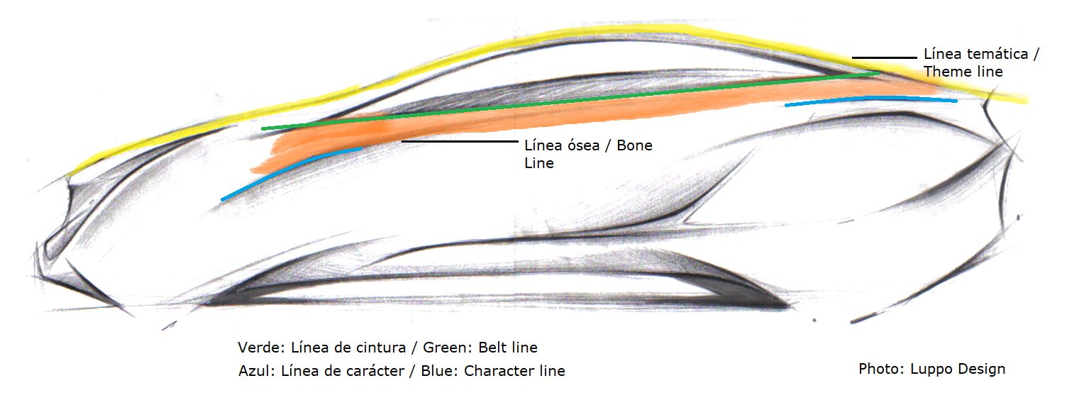
Theme Line: It is the general shape of the vehicle, for the designer they are usually the first lines of the car that define it. Most designs convey enough information with just a couple of strokes. The theme lines are used as a guide to identify the protrusions, volumes and musculature of the vehicle.
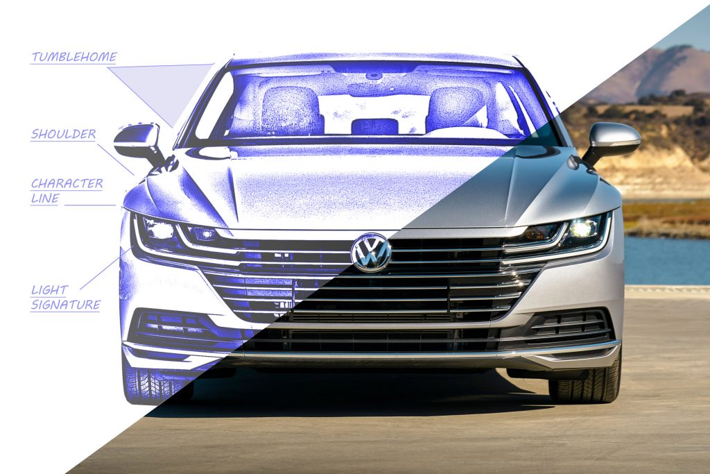
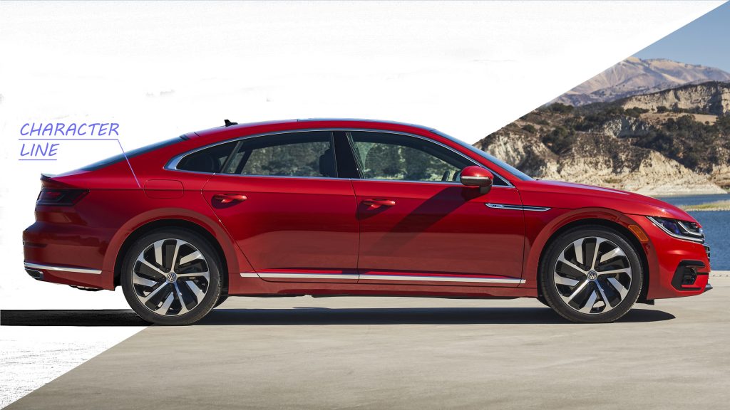
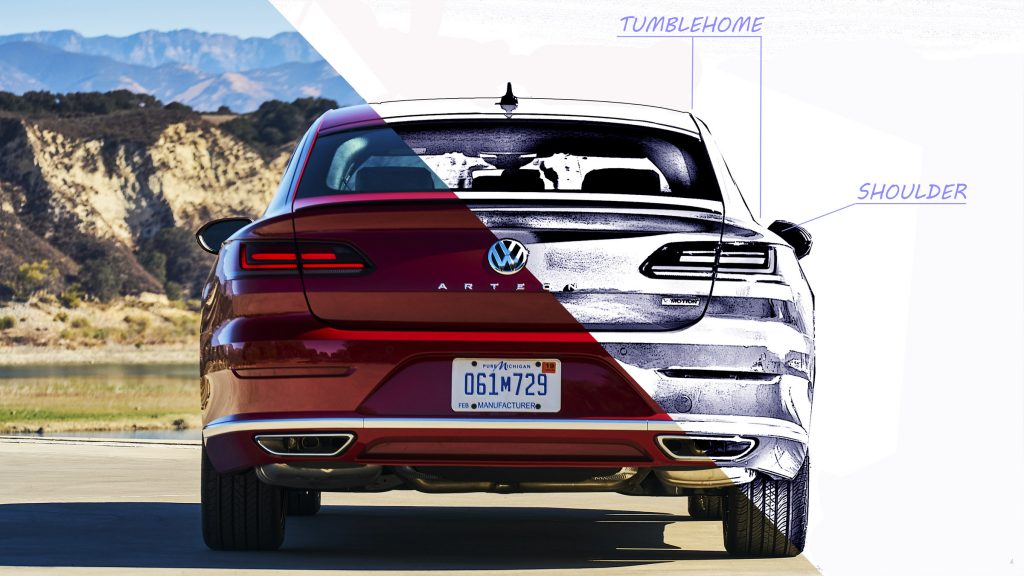
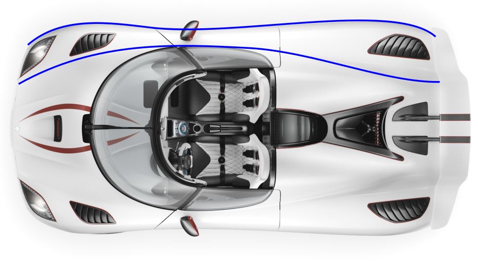
The imaginary line that connects the base of the side windows is called the beltline, we see it in green. This is supported by a line called the “bone line”, which is just below the beltline. For this particular example, depending on how the volume is interpreted, the bone line (orange area) could be below the blue line (character line). A character line is presented for aesthetic purposes to add character to the vehicle. The shoulder: When we view the car from the side, the shoulder line is practically straight with a small incline, called a wedge. But when we look at the front or the back of the car we can quickly identify the shoulder of the vehicle. It is a line that is present in the vast majority of vehicles; and it is essential when designing the volume of it. Previously we saw how Volvo relied on this line to increase the feeling of safety of the vehicle, since it is its point of differentiation. The width of the vehicle is usually limited by the width of the shoulder and is variable depending on the vehicle, although it is usually similar in most of them. When we have the sketch in side or rear view, the space between the vehicle's windows and the shoulder is called "Tumblehome". It is not exactly a line, but a space or proportion. In sports vehicles this space is larger than in utility vehicles, since the feeling of stability of the vehicle is prioritized. In vans the tumblehome is practically non-existent since the priority is to optimize the space. Plan Shape: When the vehicle is viewed in plan, it also shows curvatures that make up the Plan Shape. These make up the main lines of the side of the vehicle seen from above. These lines tend to taper at the rear.
Daylight Opening: Or also called with the acronym DLO. Refers to the area of the vehicle's side windows. The amount of glass used by the car is called a “greenhouse” or glasshouse, both in the side windows, and rear and the windscreen.
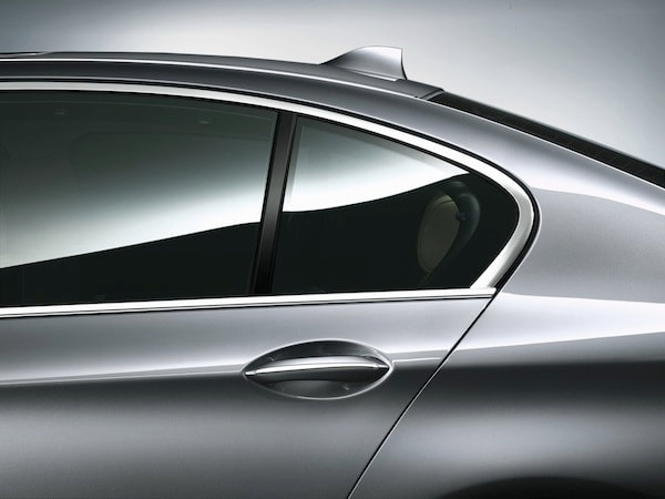
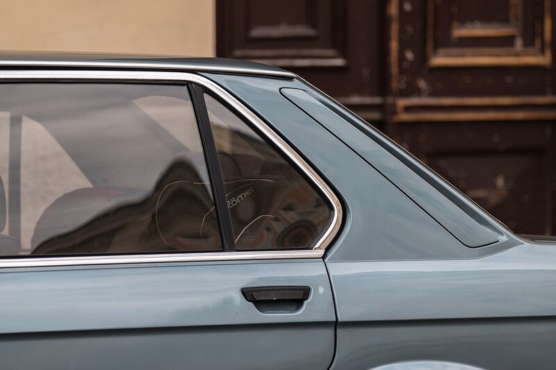
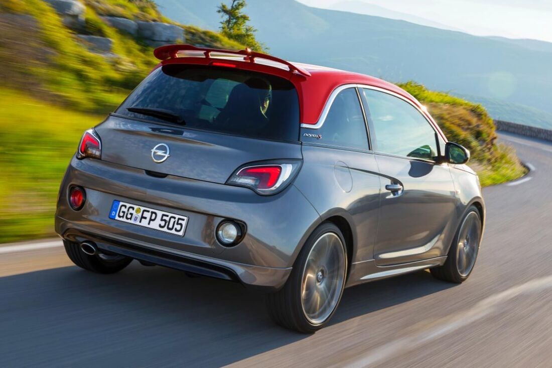
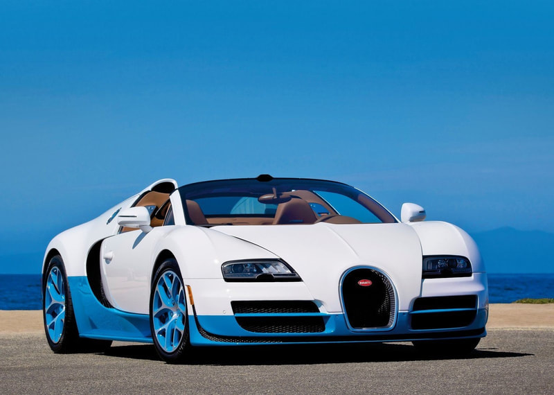
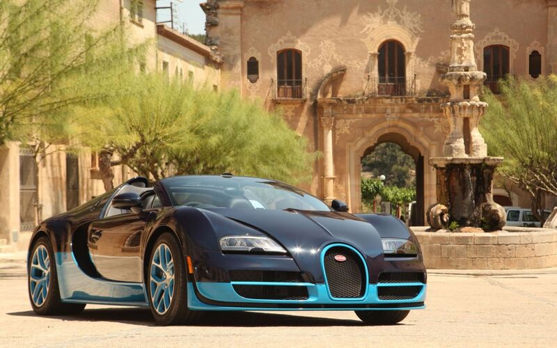
The angle of these last two elements, rear glass and windshield, determine visibility and external heat transfer. They are a primary factor in differentiating between different body styles. BMW has this line very defined with the so-called: BMW Hofmeister kink, which defines the cut-out of the rear windows in the C-pillar; so if you want to design a BMW, you have to include it. The designer can play with various visual effects. One of them is the floating roof: the car's C-pillar becomes an element that seems to give continuity to the vehicle's windows. In this way, it gives the feeling of visually eliminating the elements that support the roof of the car. This provides greater fluidity in exterior curves and greater room for passengers when they are inside the vehicle. This can be achieved in many ways, as it is a visual game, the most common are to paint the C-pillar or cover it with a glass surface to look like the extension of the rear window. This is also combined with slim A-pillars to increase the continuity effect. This, in turn, leads to many other automotive design tricks: The floating roof allows you to combine colors to obtain new sensations of volumes in the cars. Previously, combining two colors could be a problem. If we see the Veyrons shown below, our subconscious interprets that the one with the bottom blue and the top white is lighter than the other. This is because the lightest color is at the top, and the "heavier" color is at the bottom.
Logically we know the incredible characteristics of this car so the color will not determine our criteria, since we apply the previous knowledge we have about this vehicle.
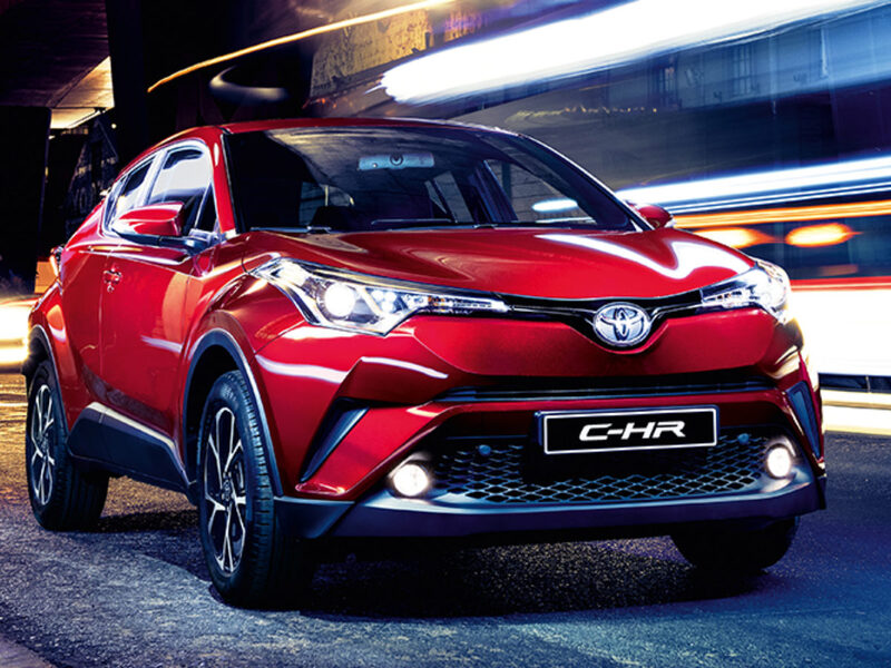
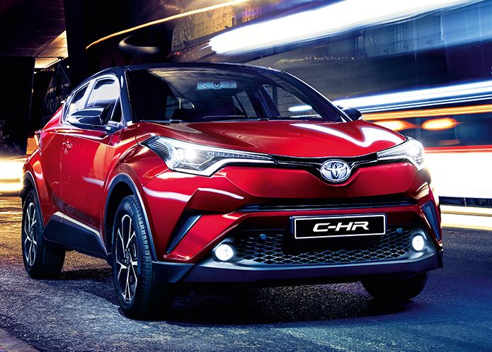
The floating roof allows us to have two completely different volumes, so the designer can play with colors without falling into risks like this. In fact Bugatti also uses a series of very interesting visual tricks to solve it. This has opened up a new range of two-tone colors that designers can play with. For example, they can use it to hide one of the two volumes, in heavy off-road vehicles the pillars and the floating roof are painted black to appear less bulky than it is. In this way, it appears less heavy, clunky and more dynamic. Below we can see a very clear example, the mind interprets that the Toyota with the black roof weighs less. This is due to subconscious levels, because in the formation of the initial volume to give it a sense it does not consider the black roof as part of the vehicle. Until the mind understands the image and understands that it is a car, then it unifies it to make sense of it. In a way, it is as if the mind understands that it is "convertible" and therefore there is less mass in the car. This creates the sense of dynamism that designers seek.
It should be taken into account that the two-tone bodywork makes the manufacturing process more complex since the second color is applied in a separate line dedicated exclusively to it.
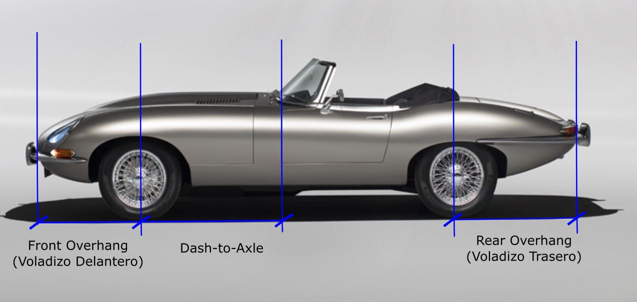
Dash-to-axle: In this case, it is not a line, but rather the space between the axle of the front wheels and the vehicle's control panel. This element is key in the design language of the brands to specify the desired proportions of the car. Historically, a larger dash-to-axle conveys a greater feeling of a powerful vehicle, as it appears to house a large engine. This concept will be lost with the arrival of electric vehicles.
The greatest restriction in the curves that we define the car is given by the requirements of the vehicle: Front or rear engine? Number of places? Rear wheel drive? Trunk size? ect. That is why it makes no sense to start drawing cars without having prior considerations.
Overhang: It also refers to a dimension and not a line. It is the distance between the axis of the vehicle and the front or side of the vehicle. These proportions affect the dynamic behavior of the car.
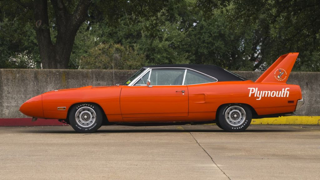
A larger front overhang leads to a larger hood and, as we saw earlier, this is associated in the consumer's mind with a car with higher performance. They also provide greater safety since, at the same quality of materials and structure, it has a greater distance to absorb the energy of an impact. On the other hand, the more weight it has distributed outside the axles of the vehicle, the worse dynamic behavior it will offer. That is, for any car it is always convenient that most of the weight is distributed within the wheelbase. If the front overhang is too large, and therefore its weight, the car tends to understeer. On the contrary, if the rear overhang is too large, it will tend to oversteer. If both the rear and the front overhang are too heavy ... well, we prefer not to know. Also, a smaller front overhang makes it easier for the car to overcome obstacles or speed bumps.
LEGAL REQUIREMENTS
Legal requirements in automotive design
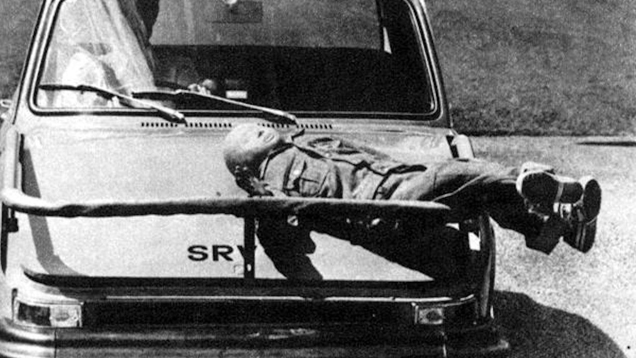
Today there are many regulations in the exterior design of a vehicle, but we will summarize some of them, according to the European regulation, but it is similar in the rest of the countries. This is important because, if we do not know them, our sketches will be discarded at the moment. Due to the density of the original documentation, and with the intention of making this delivery enjoyable, only some regulations will be mentioned superficially and in a very summarized way.
It really is much more extensive, but there are some errors that are typical in current conceptual designs that due to legal aspects could not be brought to reality, we will focus on those points.
Obviously there are much more regulations, but we wanted to summarize only some certain aspects that can be used for conceptual designs either by hand or by computer. So far, the last post of the automotive design and marketing course. In the next post we will start with the last stages of styling: Cad and clay modeling. We will explain how these processes are in a design study of a large manufacturer. With this, we finish this stage and we will move on to the next one, the digital phase. In which we also use Cad, but as we will see, there is a difference between the programs that are used in one phase and in another. We hope that the reading was enjoyable and that you have learned at least one new thing. We really appreciate the comments and likes, this encourages us a lot and help us a lot.
1 Comment
Julie Ann Jalmasco
9/9/2021 10:24:32 pm
In designing a car it should always consider safety in the road.
Reply
Leave a Reply. |
 RSS Feed